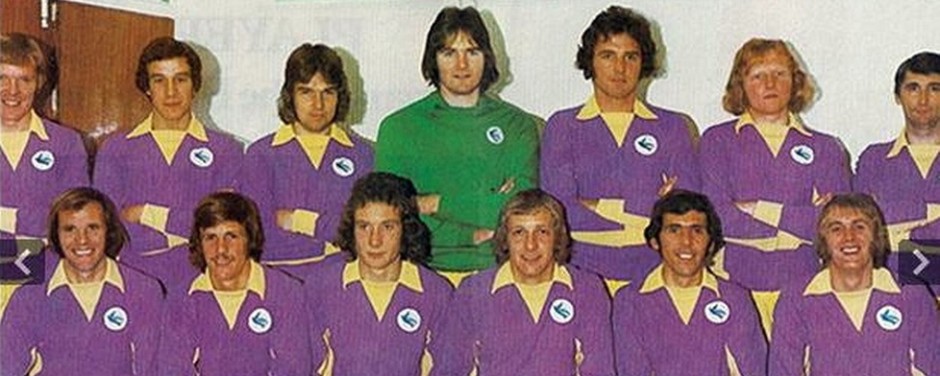
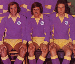
 This time last year I was using the fact that the colours we play in didn’t make too much difference to me as a reason for me being in the “reluctant red” camp and, essentially, nothing has changed as far as my general opinion of kits and team colours go. However, every now and again, a kit comes along that is so awful or mind boggling that it provokes a strong reaction from even me. An example of the mind boggling category of kit would be the one this blog is named after which appears at the top of every piece I do on here – when I first saw that kit at Fratton Park in August 1972, I was gobsmacked, I suppose this was because no other team played in a kit that even remotely resembled it at the time. Whether I liked it or not, didn’t really come into it with me, I was just bemused by it and, truth be told, I’ve come to regard it with some affection in the last forty one years.
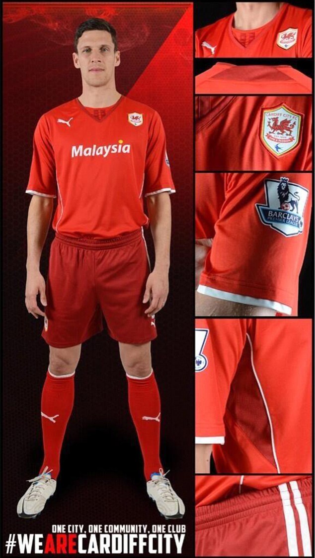
That will never ever happen with the Cardiff City kit for season 2013/14 which was unveiled yesterday though – this falls strictly into the awful category. Actually, the ensemble modeled by Mark Hudson put me very much in mind of the early 70’s era of the “classic” mauve and yellow outfit for a couple of reasons.
Firstly, I can remember having to wear a naff red short sleeved vest sometimes when playing because my “proper” kit was in the wash – although what Hudson is wearing is definitely a football shirt and not a vest, it still put me very much in mind of what I occasionally had to wear while trying to be a serious football player forty years ago!
It’s the shorts though that really mark this kit out as being seriously bad. Who else can remember their mother or sister telling them when they were young that wearing different versions of the same colour was a definite no no in the fashion stakes? I’ve never been able to figure out the reason for some of the advice I was given by the female sex when I was a nipper, but I soon realised they were right about matching colours for clothes! Now, maybe these are the ramblings of a fifty seven year old fogey completely out of touch with current trends, but, just like with the mauve and yellow in it’s time, the almost complete absence of similar such kits in this, or any other colour, suggests that Cardiff City’s 2013/14 light red/dark red combo is hardly at the cutting edge of contemporary fashion design.
Sorry to go back to my youth and that red vest again, but I can remember it getting paler and paler with each wash until it was virtually pink – almost the same colour as some of the white stuff my mum mistakenly put in the wash with it once! Therefore, until I see a team photo where all of the kits being worn by the players are the same shades as the one Hudson wore yesterday, I’m afraid I’ll be expecting them to take the field in August with the sort of kit that those of us old enough to remember playing for teams where we were all supposed to be in the same colour, but instead wore varying shades of it will be familiar with.
Even a City kit ignoramus like me can see that some of them down the years have had a “classic and stylish” look to them – I’m in agreement with many fans in thinking that the all blue kit with the yellow and white stripe of the late 70’s was one of our best and I liked the blue with white sleeves of the late 90’s as well. It’s such a shame therefore, that the club have got it so wrong for their first season in the most watched league in the world – putting the re-branding to one side for a moment, I would be saying much the same if we were talking about a two tone blue kit here, the concept of different shades of the same colour just looks cheap and tatty to me.
I put the words classic and stylish in inverted commas in the paragraph above because they are a quote from the article introducing the new kit on the official site yesterday – to be honest, it’s hard to think of much I’ve read before where the wording seems more inappropriate to the context they appear in. It’s difficult to know where to start really, but I suppose the “The two Puma King stripes reflect the fans loyalty to the club, which is appreciated by all” bit is as good as any- this bears an uncanny resemblance to the words “The PUMA King shirt, includes the famous two stripes within the neckline, representing the passion and loyalty of the fans” which appeared on the Wolverhampton Wanderers website at the launch of their new kit back in April. So, this nod to the fans is just Puma marketing speak or something that someone at Cardiff has cut and pasted off another club’s website and adapted a little – either way, it’s insulting people’s intelligence.
Well, if the object of the kit launch yesterday was to get people talking about Cardiff City, they certainly succeeded!*
The same can be said about “The club decided to maximise on the Puma King design and adopt a two-tone red home kit this season, helping us stand out in the Premier League crowd” – more marketing bollox, followed by a claim which leads me to ask why keeping this season’s black shorts would not make us stand out more, given that no other club in the league wears a red and black kit?
What takes the biscuit though is the introduction of what looks to be an important plank in the club’s policy for 2013/14, i.e. “As supporters, players, staff, whoever we are, we are one City, one community, one club. #WeAreCardiffCity “. Now, on one level (i.e. at a “normal” football club), that looks and sounds quite impressive, but given what the re-branding of Cardiff City over the past year has done, it is completely inappropriate for all sorts of reasons. Firstly, whilst I accept that it’s easy to get sucked into the whole red v blue thing on the messageboards and forget that it would not appear to be that important a matter for most of the people who turn up for home games, I’m still firmly of the opinion that if you ask the Cardiff City community (by that I mean the hundreds of thousands, or even millions, of people all over the world who take at least an occasional, passing, interest in the club) what colour they wanted us to play in, 99.9% of them would answer blue, not red and black and certainly not red shirts with slightly darker red shorts!
I don’t like using Americanisms like “elephant in the room”, but it seems appropriate here – for those representing the club to blithely go on about “one City, one community, one club” is to ignore the whale in the room (let alone the elephant!) and I’m afraid that it only gives the impression that the policy makers at Cardiff City are completely out of touch with how people feel. To be honest, this should not come as a surprise, because, although the club deserve credit for making itself more community based in some respects recently, making the sort of sweeping changes to the club’s identity that we’ve seen over the past twelve months and then expecting the fractures caused by their actions to the fanbase to be cured by the introduction of a new marketing slogan is pretty typical of the sort of customer relations “expertise” we’ve seen from them lately.
One last point, I see it’s being claimed that the awful two tone kit is all part of some cunning plan whereby everyone gets upset and then ends up being grateful for getting the old red and black kit re-introduced for next season. It’s argued by some that Vincent Tan did much the same last year when we were, first, going to change to red, then we weren’t and then we were again and then when he “reassured” us all after his thoughts about changing the name of the club during his television interview in February – he’s playing us and will get what he wants in the end while appearing to listen to the fans. If we accept for now that the kit unveiled yesterday is some sort of ruse, then I assume the “what he wants” this time is us playing in red and black next season, but would there have been such an outcry from fans if it had just been announced that it would be same again as far as the kit goes?
None of these so called clever maneuverings make the slightest difference in my book once the change has been made from blue to red. That remains the main issue here, not what colour shorts we wear with our red shirts and I hardly think that everyone wanting a return to blue are going to change their minds on that if we end up wearing red and black next season after some sort of “climbdown” by the club. No, for me it’s much more simple than that, the club, just like they have done with every kit related pronouncement they’ve made since the game with West Ham to end last season, have just dug themselves into a deeper hole through their own ineptitude and lack of rapport with the “community” they claim to be part of.
* Picture courtesy of http://www.cardiffcityfc.co.uk/